Paw Paw Ice Cream
Brand Identity
Packaging Design
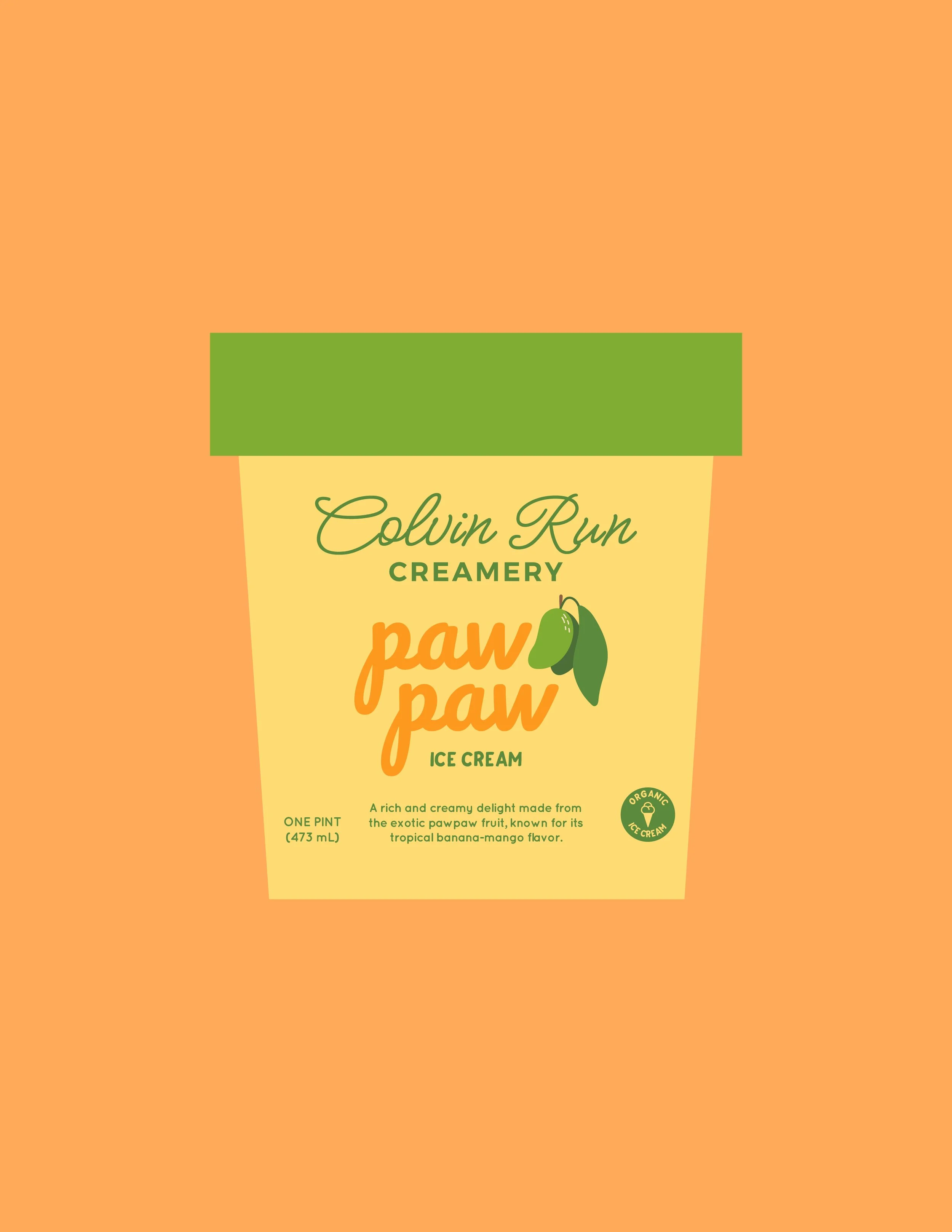
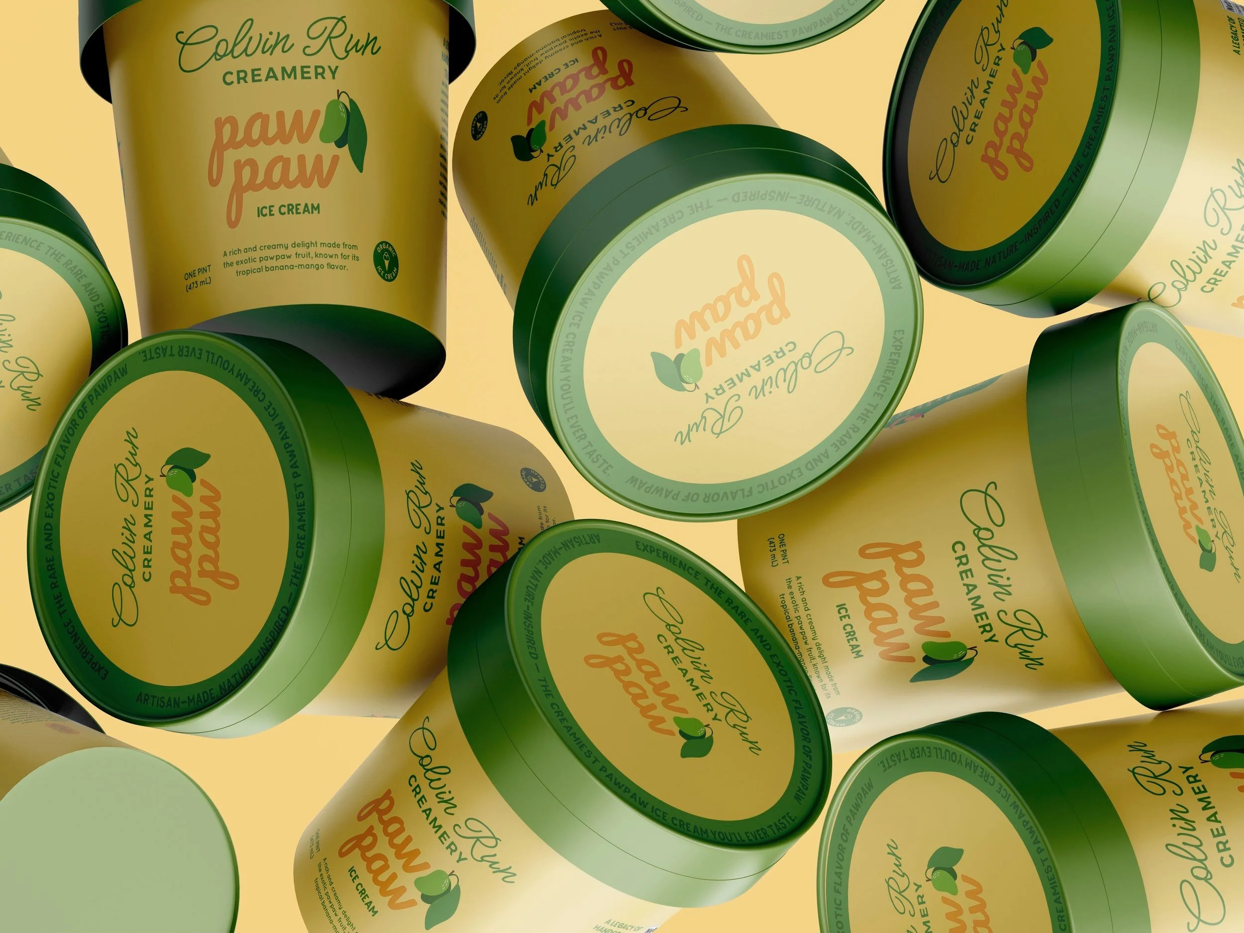
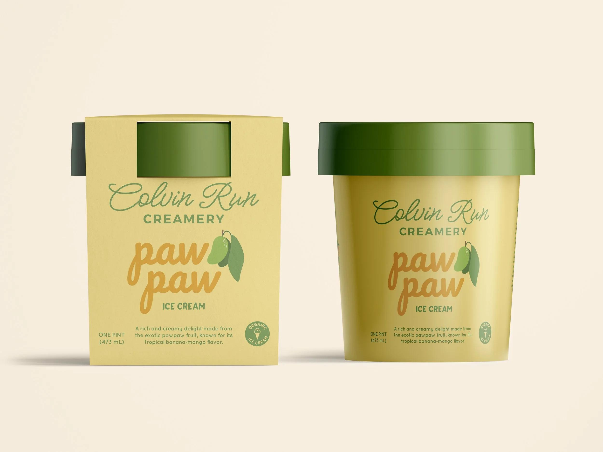
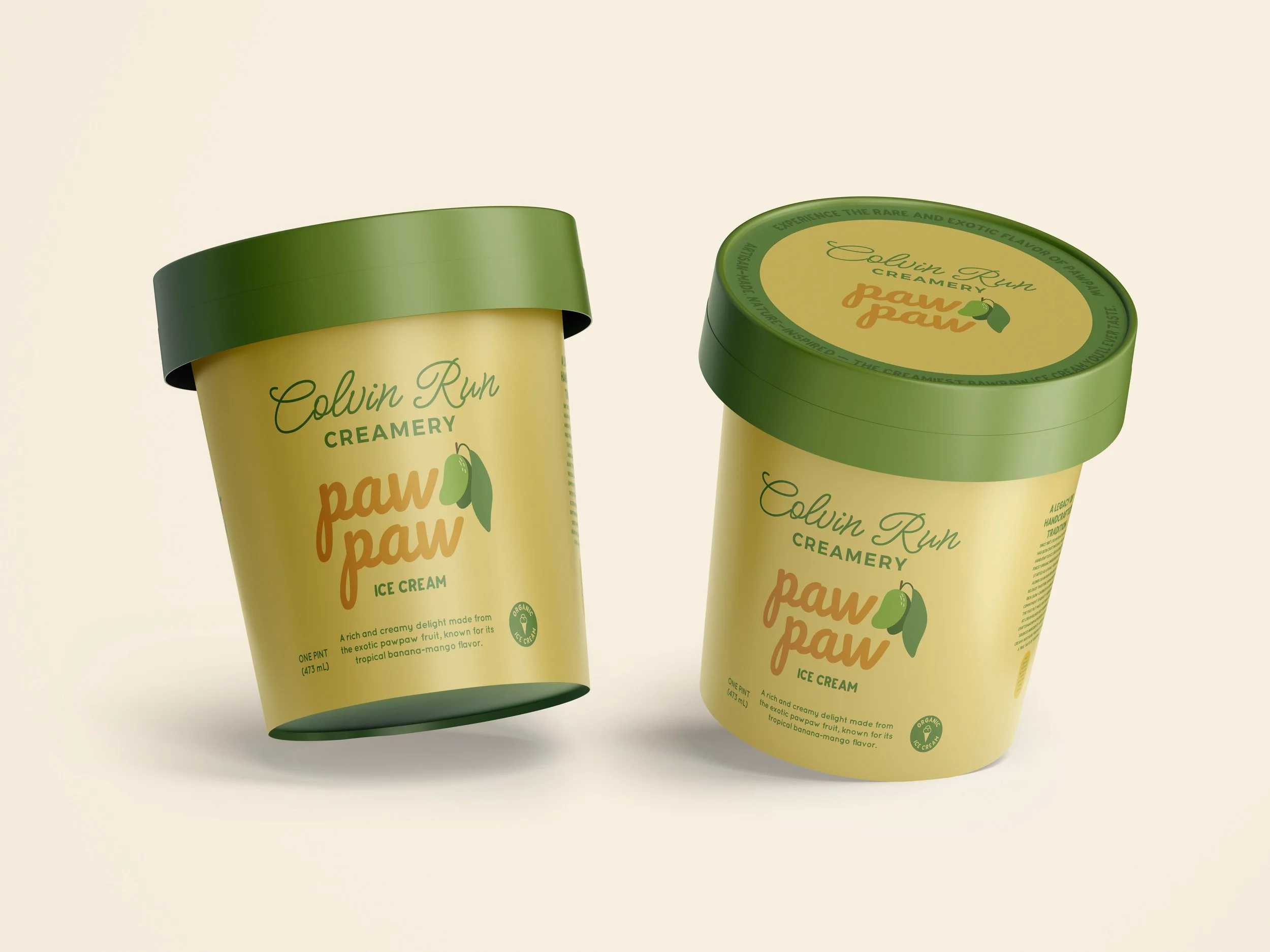
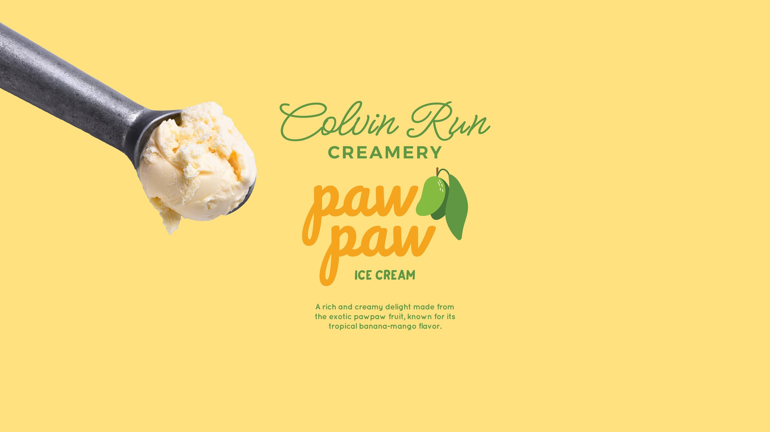
Colvin Run Creamery’s new pawpaw ice cream celebrates a unique, tropical-like fruit native to North America. The label design process focused on capturing the pawpaw’s rich, custard-like flavor and vibrant colors while staying true to the creamery’s handcrafted, small-batch identity.
-
Inspired by the fruit’s golden-yellow flesh and soft green skin, the color palette brings a fresh, natural feel. A simple fruit icon illustration keeps the design clean yet playful, ensuring easy recognition. Typography blends nostalgic charm with modern simplicity, creating a look that is both timeless and inviting. The final design reflects Colvin Run Creamery’s tradition of quality while introducing an exciting new flavor to its lineup.